Logos
The Pharmaxo group uses a logo system that applies to the group and its specialist companies. The common brand aims to have a single, unified identity that our customers and the public will recognise.
The group comprises several specialist companies. These brand guidelines apply equally to the group and its specialist companies.

Logo anatomy
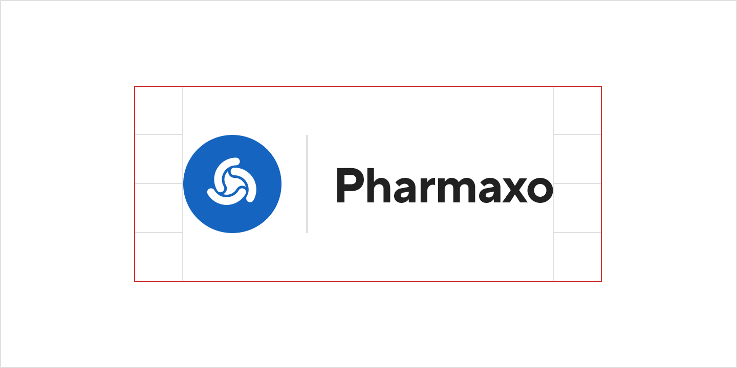
The logo comprises a solid roundel containing a Luer lock symbol, followed by a divider, followed by the group name and optional company name.
Full description of the logo
Group logo:
- Blue (#1565C0) circle (48px²)
- Containing white (#FFFFFF) lure lock icon (24px²), optically centred
- Followed by a space (12px wide)
- Followed by a light grey (#E0E0E0) divider (1px by 48px)
- Followed by a space (12px wide)
- Followed by group name in title case in dark grey (#212121), typeset in 36px TT Norms Pro Bold with -2.5% letter spacing and 48px line height
Specialist company logos:
- Blue (#1565C0) circle (48px²)
- Containing white (#FFFFFF) lure lock icon (24px²), optically centred
- Followed by a space (12px wide)
- Followed by a light grey (#E0E0E0) divider (1px by 48px)
- Followed by a space (12px wide)
- Followed by group name in title case in dark grey (#212121), typeset in 20px TT Norms Pro bold with -2.5% letter spacing and 20px line height over division name (in local language) in title case in dark grey (#212121), typeset in 16px TT Norms Pro Regular with -2.5% letter spacing and 16px line height
- All vertically centred
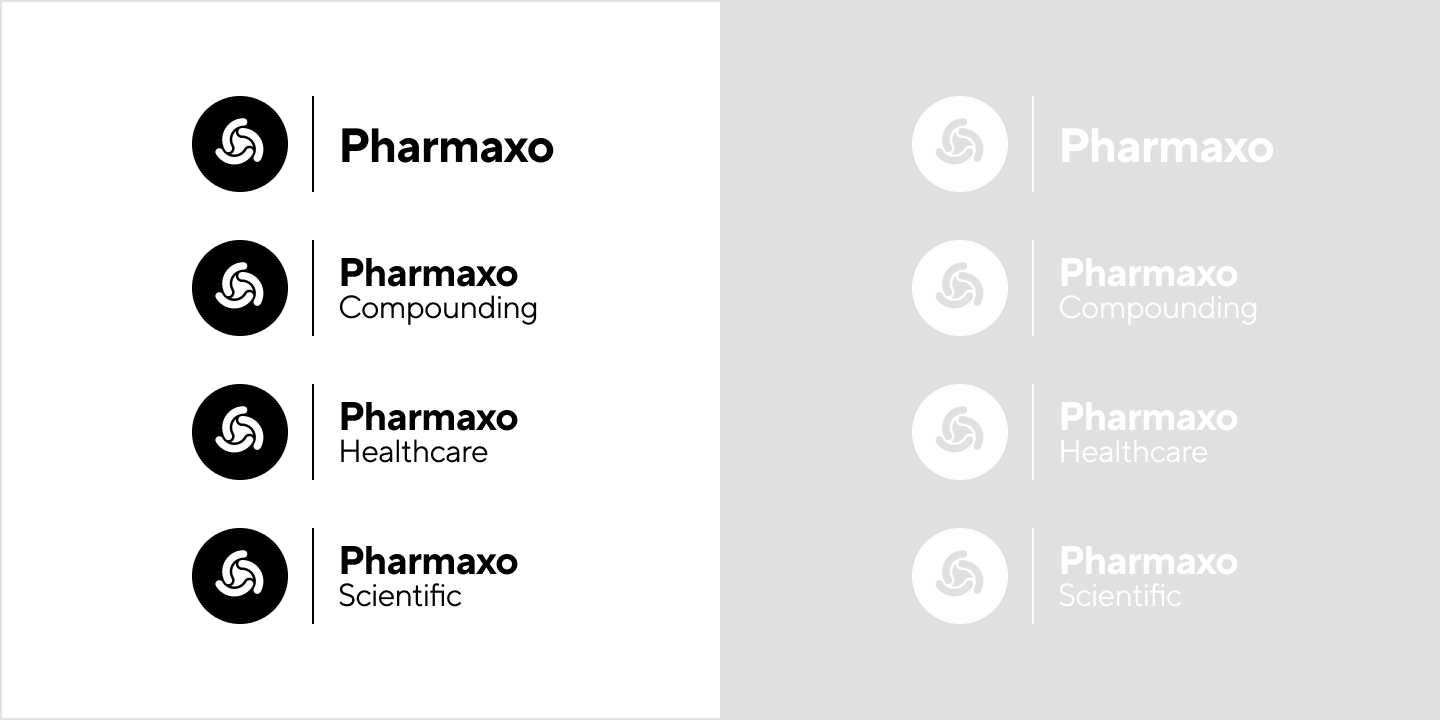
Black variations: As above, but with all elements in black (#000000). Luer lock is cut out of the circle.
White variations: As black variations, but with all elements in white (#FFFFFF)
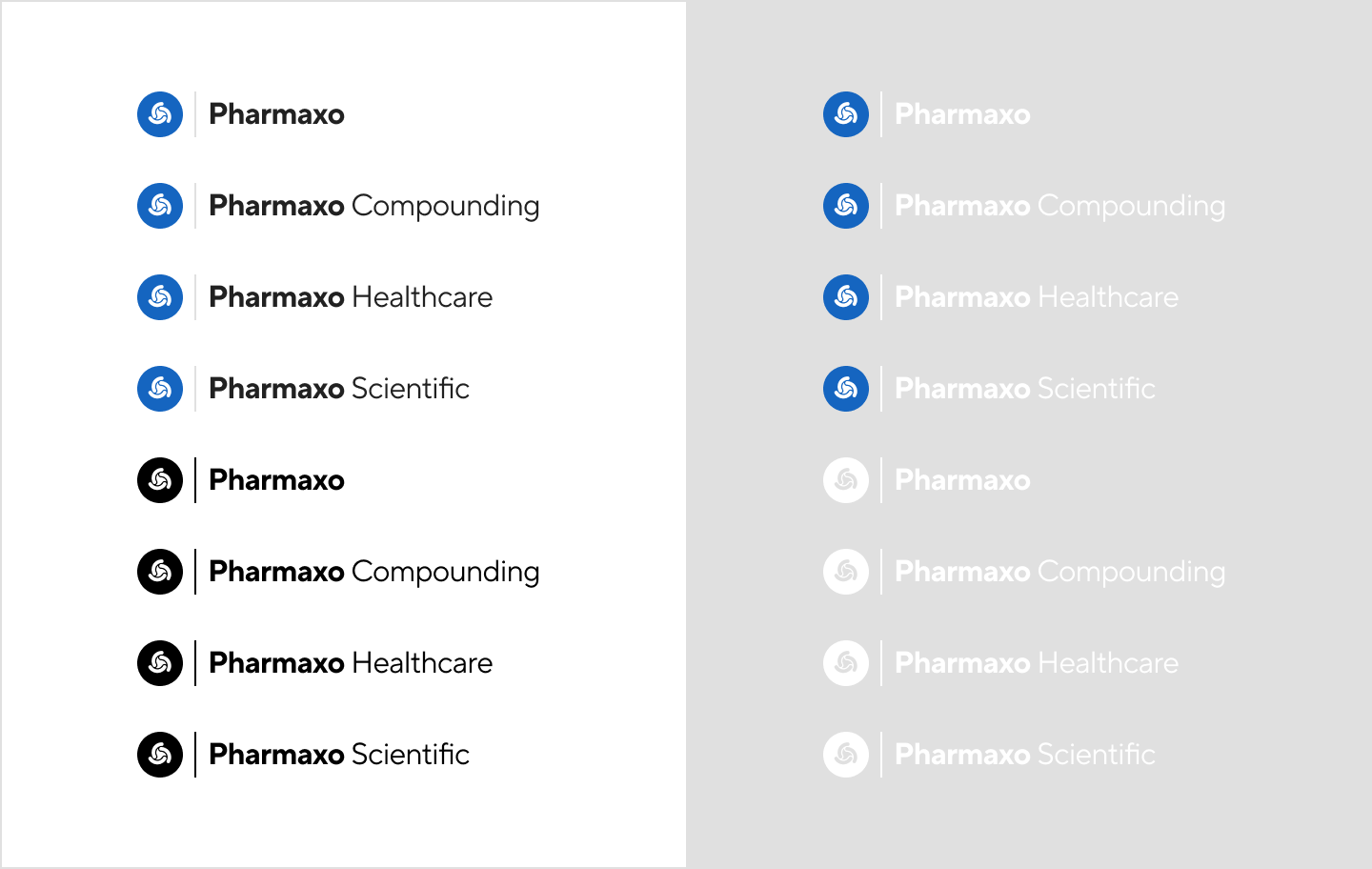
Logo colour variants
There are four colour variants of each logo to suit different situations. Use the correct variant for your application to make sure it is legible.
- Use the colour logos with black text on white or very light backgrounds.
- Use the colour logos with white text on black or very dark backgrounds.
- Use the black logos on light backgrounds.
- Use the white logos on dark backgrounds.

Tips:
- Judge on a case-by-case basis which colour variant you should use.
- Never place the logo over a noisy background.
- Use the black variant if you suspect the logo will be printed in back and white (for example, on product labels).
Logo layout variants
In rare and exceptional circumstances it may be necessary to use a compact, inline variant of a logo. Check with the marketing team before using these variants.
Exclusion zones
The logos need space around them to stand out and be easily recognised. Don’t put any other content closer to a logo than half its height. For example, if the logo is 2cm tall, don’t place anything within 1cm of it.
Profile pictures
Use the same avatar image for all group or specialist company profiles (for example, social media pages).
Tips:
- Different websites use different border radii for profile pictures. Always use a square avatar and let the website apply its own border radius.